Whiteboard Animation Videos: 7 Tips for Using Them for Promotions

Videos are an excellent way to put your products in your potential customers' minds, that much is a given. But what happens when a product or service is just too intricate, abstract, or technical for a regular video to work?
For a marketing video to work, you need to ensure you capture your viewers’ attention and then hold it long enough to deliver your message. Otherwise, you’ll have, at best, a disappointing piece of content, and at worse, a disastrous one.
A whiteboard video, if done right, can convey your product’s message in an easy-to-follow, engaging style. Regardless of the complexity of the subject matter.
The operative piece being “if done right.”
As simple as they might seem from the outside, whiteboard animations are anything but. There are thousands of whiteboard animation videos out there, but many fail to have that impact on audiences they intended initially. Why?
In this post, we will go over rules, tips, and tricks to create effective whiteboard animation videos and improve your whiteboard animated video’s performance.
But first, let’s get the basics out of the way.

What Is Whiteboard Animation?
In case you are new to the video marketing game, whiteboard videos are pieces of video content that follow a specific style and format.
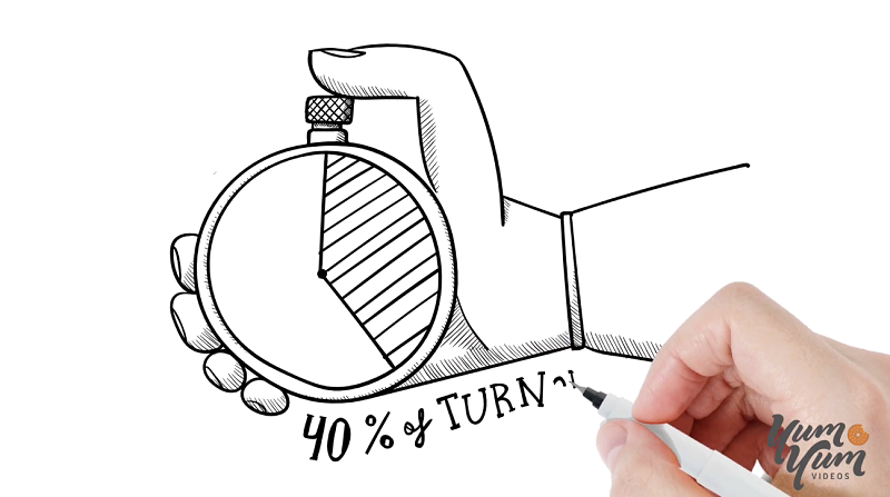
In their barest form, whiteboard videos consist of a white background that comes to life thanks to animated, black marker drawings guided by an animated hand.
This style conveys the feeling that the drawings are being traced and animated in real time. From the outside, it seems like a simple enough formula, but there’s a lot more that goes into it!
Top Tips & Rules for Creating Effective Whiteboard Animations
To create unique and effective whiteboard animations, you need to know the “rules” of the style, and how to translate your message in a black-and-white cohesive, engaging story.
Let’s check out some of the most important tips and rules for creating powerful whiteboard animations to keep in mind include:
1. Don’t Break the Thread
You might already know that marketing videos should tell a compelling story for them to be effective. Animated marketing videos should include a "what," a "how" and a "why".
Whiteboard animations generally perform better than shorter videos and are more directed to a specific audience. But how about continuity?
Invisible but logical threads of information should connect the story you tell in your whiteboard videos. Try not to erase the board every time you explain something since your viewer might lose interest or be confused by all the separate segments.
In other words, the impact of the video might lose strength with every “cut” you introduce. Avoid cuts whenever possible.
Instead, your narrative should flow as if consecutive scenes flow from one another. The “how” and “why” of your video should seem like the only logical answer for your videos’ “what” (or problem to solve.)

2. Choose (and Use!) Your Characters Wisely
Your main goal by making whiteboard animations is to make a product or service more accessible to your audience. So, why wouldn’t you base your videos’ characters around them?
Create and use characters viewers can empathize with and relate to. Characters that feel close to their own experiences.
Once you have those, your main goal becomes helping those relatable characters come to life. After that animated hand on your video draws them into the scene, don’t leave them static. Animate them!
This practice will make your video a million times more engaging than static ones, which was your ultimate objective after all.
3. Use Color Intelligently
The beauty of whiteboard animation videos resides in its soft, delicate black-and-white delineation. However, that doesn’t mean color should be entirely absent.
Quite the opposite, in fact!
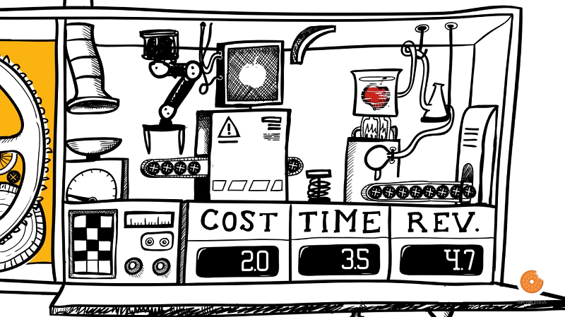
A hint of color can highlight critical points of your message more powerfully, and give them permanence in viewers’ eyes. By using bits of color here and there, your audience will have an easier time retaining and responding to the information being received.
Furthermore, it is usually a good practice to employ the same colors and tonalities from your brand's logo. Do that, and after watching your video, audiences will have a much easier time, not only to internalize your message but directly tying your brand to it.
Having said all that, color in a whiteboard animation is a resource to be used sparingly. Excess usually drains its effectiveness and breaks the format.
Figure out when it will have the most impact, and use color there and there alone.

4. Aim for the Perfect Voice
Your videos’ voiceover should be professionally recorded, sound, and feel real.
An automated voice generator might be a bad idea if you want your video to inspire views, likes, and shares. Most viewers will feel discouraged to keep watching along with a clearly fake or robotic voice.
That said, even with a professional voiceover, your video could sound out of place with the wrong voice.
Since the voice is recorded separately from the images, you could end up with a completely different version from the one intended. To avoid that, be sure that the rhythm, tone, and pitch of the voice fit the images as you progress your work.
How? Take a look at your target audience and check out your characters. What do they look like? Who are you modeling them after? Do you need a young, dynamic voice or a more conservative tone? Is it a fast-paced video, or does it take things slowly?
Consider these things when casting for voiceovers and you’ll find the right match.

5. Do Not Skimp on Quality
A low video quality, shoddy animation, or subpar drawings will inevitably lead to annoyed viewers, and soon after that, to a potential customer lost.
Keep in mind that, online, your content’s quality is a stand-in for your company’s skill in your audiences’ eyes. After all, until they progress their customer relationship with you and convert, they have little else to go on.
Nowadays, audiences don’t have much tolerance for low-quality content, making the idea of consulting with a skilled animation company that much more appealing.
If you are trying to sell your audience something, your content should reflect the quality they are to expect from the product! So, don’t cut corners there.

6. Include a Logo and a Call to Action
Don’t forget to include your brand’s logo! Ideally, before the second half of your video.
By the same token, as you reach the end of your piece, be sure to tell your audience in no uncertain terms what you’d want them to do next: Visit a website, download an eBook, sign up for a newsletter.
The goals will vary depending on your video's objective, but make sure to always include a call-to-action (CTA) that supports it at the end.

7. Include Digital Effects
To brighten the scenes, use digital tools to help you whiten the background and darken the black lines.
Consider adding a tune, but make sure it has a rhythm that matches the animation and the voiceover. Turn down the volume if it sounds distracting. Don't be afraid to turn it off if it doesn't add value to the video.
Adding sound effects to go along with important animations can also help increase immersion and impact of your whiteboard animations.
Every little detail of your piece should be in sync – One mistake, and the viewer will scroll down or look away. But manage to pull it all off, and you’ll have a killer whiteboard animation on your hands.
In Conclusion
Whiteboard animation videos are an incredibly powerful asset to explain and promote your products, services, or ideas to an audience. Their signature white background and black marker animated drawings make information more easily digested.
However, there’s a lot that goes into them to make the videos effective. Apply the various aspects of whiteboard animation videos discussed above and apply the advice. The result will be much leaner, more beautiful, and more compelling whiteboard videos that will meet your promotion and marketing goals, as well as expectations.


![Feature Image - [node:title]](/sites/default/files/styles/video_thumbnail_bottom/public/girl-happy-640.jpg?itok=l-InHslr)
![A Parent’s Guide to Having Kids Live an Active Lifestyle [node:title]](/sites/default/files/styles/video_thumbnail_bottom/public/Little%20Girl%20Bike%20Kids%20Live%20an%20Active%20Lifestyle.jpeg?itok=lN-nALtw)
