The Science of Colors in Marketing and Branding
The colors you use in branding and marketing play a significant role in how you are perceived. Brand colors help in creating a good identity for your company and also help to convey the right emotions, feelings and experiences, which come together to boost your overall brand image.
Because you want to always bring your offer, messages and uniqueness to the fore in the best possible light, you cannot leave it to chance when it comes to colors you use on your website, logo and even social media postings. You want to be strategic in all your color choices.
In this post, we’ll dive into the role of branding colors in a company and how colors actually contribute to success in business. If you have ever wondered why the colors of certain companies are easy to recognize and remember, while others are not, we have answers for you.
How do colors work in your business, anyway? What role does your environment play in your brand colors? Are the colors you use helping or hurting your business?
Color specialists from Snap business printing Geebung offer answers to some of these questions and highlight more on the science of color in business branding and marketing.

MJ and David, owners of Snap Print & Design Geebung.
How Do Branding Colors Work?
Why is it even essential which colors we use in our branding? We could just use our favorite color.
Well, colors primarily affect the viewer’s subconscious mind. There color can convey your philosophy and brand message to your desired customers. That is why colors and their effects play an important role in your company’s appearance, communications and marketing.
Colors also act as eye-catchers and thus attract the attention of the viewer and remain in memory. This is particularly important when implementing memorable marketing for your company.
The colors in your branding also evoke emotions—and these are ultimately decisive for the viewer’s engagement and purchase decision. The perceptions, associations and emotions evoked by colors vary widely, depending on several factors, including the color type and viewer themselves. Not every color has the same effect on everyone. Understand color psychology and it will help you achieve the emotional reaction you want.
Basically, color psychology looks at the effect of colors (and color combinations) on people's perceptions and behaviors, and the effect it has on our emotions and minds. The effect of colors itself cannot be denied, but it is not always obvious how colors are perceived by someone and impacts them. This is because there is a very individual nature to color perception.
Our individual color perception and preferences is influenced by many things that are personal to each one of us, including:
- Personal tastes
- Education
- Experiences
- Trends
- Culture, and
- Context in which color appears.
The colors you choose for your brand and designs should therefore represent the individual and brand personality your business deliberately chooses and wants to convey to customers.
Ask yourself how you want to be perceived. How do you look most authentic to others? Then, choose colors that reflect those personal brand decisions.
Credit: The Logo Company
How to Choose the Right Brand Colors for Your Business
When choosing your color, it is important to know your target group well and to know which life situation and phase they are in. To pick them up where they are, you should put yourself in their shoes and not just merely fall back on your own tastes and preferences.
It matters not so much what branding colors you like, but that the colors you choose depict your values, messages and personality appropriately and help you get the results you want from your customers. What emotions do you want to evoke with your visual appearance? What do you want to be associated with? That is more important than your personal, narrow color preference.
For example, a management consultant who specializes in crises and financial problems for their clients will probably want to achieve a different effect with colors than someone who works with motivated start-ups in their setup and innovation implementation phase. Both are management consultants but they have different target groups who are in different situations, calling for different color choices to get the right behavioral and physcologial impact.
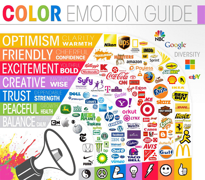
How to Use Color Theory (Specifics of Color Psychology)
Color psychology (or color symbolism) describes the effect of a special color on our psyche, our emotions and our perception. It's an important factor to consider when using colors in business.
To bring you closer to the branding colors you should use for your company and your marketing, let’s now devote ourselves to the different colors you can use in your company for different marketing and branding purposes:
GREEN
The mixture of yellow and blue is the most balanced of all colors. Green is often used in connection with nature (products). Green also fits well with health issues, nutrition, nature, environment, and sustainability.
As a color scheme, green can make your business appear youthful and fresh and give your customers a certain sense of balance.
When used correctly, green can also have a positive effect on customer satisfaction and workers harmony in the company. Too much of it, however, often seems playful and ungrounded.
BLUE
Blue is (along with yellow and red) one of the primary colors and the counter-color to orange. It is one of the relaxing, cool colors and can be both permanent and clear.
At the same time, blue also stands for unimagined possibilities and insight and is the color of loyalty and security – that is why it is used widely by banks, lawyers and more.
In my eyes, blue is an underestimated, diverse color. It has many positive properties and can look very fresh and lively, depending on the tone. Depending on the shade, blue has a soothing and cooling effect.
For brands, blue can have a positive effect on loyalty between you and your customers, and also helps you to convey a feeling of security.
As a branding color, blue is suitable if you are in an industry that deals with financial issues, advice (legal or tax advice), or you generally want to give your customers a high level of security so that they can open up.
PINK
This color has relatively similar properties to red, but is less aggressive. Pink expresses the primeval female power, stands for love, affection and helps us to express our feelings.
Pink also has very empathetic, soft and lovely vibrations. Muted shades of pink appear very gentle, empathetic, but also quickly immature.
As a rule of thumb for the exact shade to use, go for the darker, the stronger and more powerful pink looks that represent mature friendship, affection, harmony, inner peace, and approachability.
In business, pink is deliberately used, very powerfully to give a certain assertiveness, but in empathetic way. You can also incorporate pink into your branding colors if you want to help your customers let their feelings out and feel cared for and treasured.
RED
Red (along with yellow and blue) is one of the primary colors located opposite green in the color wheel. It is a strong signal color, communicating determination, strong will and perseverance.
Red stands for activity, energy, love and has a very stimulating effect. When used in a targeted manner, red also has strong powers to convey dedication and is particularly recognizable in marketing campaigns.
By the way, red and yellow are joint kings in the food branding world, invoking taste buds and stimulating the appetite. Just add a little hint of it if you plan to evoking appetite in your food business.
Contrary to the general opinion that red is always a warm color, I believe that red can also be cold.
You can use red in your company and for your branding if you want to convey perseverance and performance. But be careful. Too much red can quickly become aggressive and screaming.
YELLOW
Yellow is (along with blue and red) one of the primary colors and the opposite color of violet. Many people associate yellow with joy and have very positive memories and sentiments with this color. Summer, sun, sunshine.
Through the targeted use of yellow, you can brighten people’s mood. We feel more joyful and it has a positive charm on people.
Yellow also often promises a certain level of maturity and quick mind.
As a brand color, you can attract attention with yellow, but beware of very bright tones. As a rule of thumb: the warmer the shade of yellow, the more pleasant for the eyes. If you use this yellow as a branding color, you can comfortably direct the viewer's eyes to important information.
Topics that you can get across well with yellow are those that should exude a certain maturity. But scientific topics that are brought closer with ease are also served well with yellow tones.
WHITE
White stands for purity, perfection, spirituality and infinity in Western cultures and attitudes. From a physical point of view, white is everything - it is the sum of all colors. Therefore, it can also be combined with all colors - especially as a background or negative space.
White is a notable design element due to its distinct properties. This color implies purity and can be used generously. For example, a logo, liberally placed on a large white surface usually looks very classy.
Do not be afraid to leave white areas in your designs. Not everything has to be filled with info, bells and whistles. Just look at the Adobe, Amazon and FedEx logos that make great use of white for inspiration.
Amazon and FedEx logos.
BLACK
Black is the result of lack of light. It sounds strange, so I’ll admit I do not like this definition. However, depending on the combination with other colors, black can look sporty, elegant, luxurious, or bald.
When used correctly, black is a very important color in design, marketing and branding of your company. It can be combined with most colors and is particularly popular with texts due to its good legibility on a light background.
Conclusion
So, you see, colors are a very extensive topic, and therefore you should not handle them too lightly. Learn all you can about color psychology in marketing and apply it in your business, especially in your visual branding. It will help you in reaching your branding and marketing goals.