Product Packaging Psychology: Why Consumers Are Attracted to Good Packaging
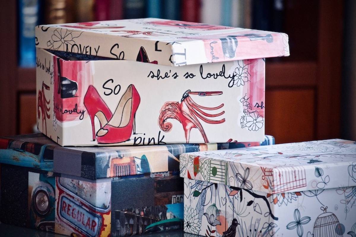
Making sure your business capitalizes on every opportunity to promote itself can be critical when it comes to standing out from the competition. An often-overlooked way of promoting your business is through your packaging, which should be a fundamental part of the marketing plan for any business.
However, whenever we think of marketing, we generally fall into the trap of thinking solely of advertising, such as TV, print, radio, and online. But, any marketer worth their salt will know this is not the whole picture.
Marketing refers to everything a company does to promote the buying of a product or service – including the packaging a product is wrapped in. Even if your business doesn’t make or sell physical products, service-based businesses can still make use of ‘physical evidence’ to help drive sales.
Packaging is an essential part of marketing. It is generally the last advert a consumer will see as they are deciding what to buy on shelves – or once it arrives on their doorstep if they ordered online. Your packaging should therefore speak loud and clear for your product when you can’t be there to do it for yourself. ;
Knowing how to get people to respond favorably to your product packaging will help to capture attention and entice consumers to buy. As such, every business needs to understand the power of packaging to encourage sales.
But what makes certain packaging designs catch the eye, while consumers completely ignore other products?
Psychology Behind Effective Product Packaging
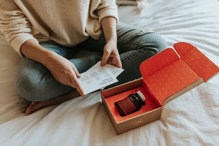
Print and design experts Solopress explored how packaging can enhance a consumer’s desire to purchase, investigating the ways in which shape, color, and sustainability can influence the customer journey. The findings were insightful.
Key Findings:
- 85% of consumers said that color is the main reason for making a purchase, according to a Small Business Trends survey.
- Red, yellow, green, and pink are most attractive colors for human attention.
- 67% of consumers consider it important that the products they buy are in recyclable packaging, with 70% of all consumers saying they would be willing to pay more for a product that uses it.
- While there is no one perfect shape for all packages, shape has been shown to trigger strong emotional responses in people, such as excitement, fear, awe, and contentment.
- Evidence suggests that consumers find curves more appealing than straight lines, describing things as beautiful if they were curved as opposed to rectangular.
- Three-quarters of us would prefer to ‘feel’ a product before they buy.
- Harvard Business Review found that physically holding a product can actually create a sense of psychological ownership, which can help to drive must-have purchases.
- 55% of shoppers said that the number one irritant with packaging was products that were difficult to open.
- The clear demand for sustainable packaging is set to continue with 61% of UK consumers limiting their use of single-use plastic and 34% opting for brands that have environmentally sustainable values or practices.
Below, we look at the psychology behind effective packaging in detail.
1. Color
Consumers like to see strong use of color when it comes to product packaging, as it enhances the overall attractiveness of a product.
In fact, in a Small Business Trends survey, 85% of consumers said that color is the main reason for making a purchase. However, choosing the color of your packaging should be done diligently, as similar types of products will often adopt similar packaging color and design, and each color is associated with certain attributes.
In terms of packaging, the use of color should help your brand to do three things: capture the shopper’s attention, create appropriate emotional associations, and reinforce brand identity.
For capturing attention, certain color wavelengths, such as red, yellow, green, and pink, have been shown to attract human attention. Therefore, using these colors on your packaging will physiologically increase the likelihood that someone will look at your package.
However, that isn’t to say that every single product package should be red, yellow, or green. If all packages used the same colors, then no product would ever stand out (based on color alone). This is where the isolation effect comes in – things that are visually different from their counterparts can stand out and capture our attention.
So, if all your competitors are using green or blue packaging, why not use yellow or orange to isolate your package and steal the focus?
As well as capturing attention, certain colors have developed certain emotional connotations. For example, gold, silver, and black are heavily used for luxury products; white is a popular color for cleaning products as it is associated with purity and cleanliness; and red has been found to encourage appetite and create a sense of urgency – which is why it’s often used in fast-food and clearance sales.
The important thing to remember is to choose colors that trigger the kind of associations you want customers to make with your product.
Finally, when it comes to color, there should already be certain colors associated with your brand. Your logo should be featured prominently on your packaging so that consumers can identify a brand they know and trust. The colors of your packaging should use your logo as a starting point – whether that is similar or contrasting colors, they should work well together!
2. Sustainability
There is an increasing demand for sustainable packaging amongst consumers, which means brands are expected to use packaging that can be recycled or reused, while also using fewer materials, creating less waste as a result.
67% of consumers consider it important that the products they buy are in recyclable packaging, with 70% of all consumers saying they would be willing to pay more for a product that uses it. As a result, companies are making strenuous efforts to reduce the amount of packaging they use, which can also be a good way to let your consumers know that you care about the environment.
Using recycled and biodegradable materials in product packaging will reinforce consumers' good feelings about the product.
However, be careful of just using eco-friendly packaging to make a few extra sales, as consumers are quick to spot spurious attempts at ‘green washing’ and can create feelings of distrust in brands.
3. Shape
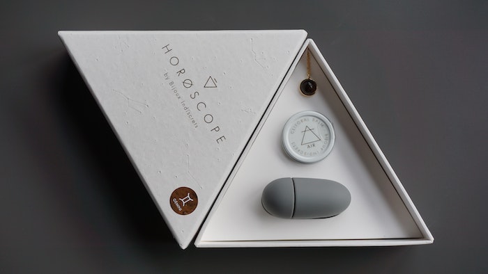
While there is no one perfect shape for all packages, shape has been shown to trigger strong emotional responses in people, such as excitement, fear, awe, and contentment.
Packaging shape must also be considered from a practical point of view. Functionality and practicality should inform the overall design and shape of packaging to ensure that products can be transported, stored and displayed as effectively as possible, minimize the risk of damage and encourage consumers to purchase.
Using shapes in your packaging can also help to reinforce a contextual message with your product, which has the potential to create a powerful emotional reaction in your consumers. ;
However, there are general psychological guidelines to take into consideration. For example, there’s a strong body of evidence to suggest that consumers find curves more appealing than straight lines, describing things as beautiful if they were curved as opposed to rectangular.
Attractive shapes induce more intense brain activity, as well as triggering signals in the brain associated with our internal reward system. Conversely, other research has shown that we perceive sharp, angular lines as threatening.
Aside from linear designs, slim, narrow products are generally associated with health, whereas short, blocky products are viewed as sturdy and bold. Even complex shapes have their own associated emotions and can be made into another element of branding - just look at Toblerone as an example.
However, bear in mind that connotations of shapes can change over time based on cultural shifts, which forces designs to adapt and update. In the late nineties, the technology of the future was bold, blocky, and angular. Today, it's all sleek, rounded corners.
Don’t be afraid to think beyond traditional packaging shapes. But make sure that “different” isn’t your only criteria. Aim for a package design that is different, product-appropriate, and brand-relevant. But also keep in mind the basic psychology of shapes.
4. Touch
One of the things we forget as marketers, is that the more senses we can trigger amongst our consumers, the more likely they are to pay attention. Touch is a great way to create positive tactile experiences for consumers.
Whether it’s the texture you use in your packaging, or the materials present in your product, the feel of your product and packaging can resonate with consumers on an intimate level.
We tend to think about consumers using touch primarily because they have to — in order to examine packages and to put them in our trolley. However, touch can also create symbolic connections between people and products, and between buyers and sellers.
Up to three-quarters of shoppers polled in a survey said they would prefer to ‘feel’ a product before they buy. In a perfect world, everyone who sees your package design will be motivated to pick it up and take it home, but that isn’t the case. For that very reason, touch should be taken into consideration when planning your packaging design.
Harvard Business Review found that physically holding a product can actually create a sense of psychological ownership, which can help to drive must-have purchases. The way packaging feels can also have a significant impact on how the product itself is perceived.
A classic example of this is an experiment, whereby water served in a sturdy cup was perceived to be better than the same water served in a flimsy cup—the product was the same, the perception was different due solely to the packaging method. Flimsy packaging made people worry that the product inside was shoddy, too. ;
Choose a packaging that reflects what the consumer will find inside. If your product is luxurious, then select packaging material that feels luxurious. In contrast, an earthy and natural product may be more suited to packaging that has a raw, earthy texture.
Each tactile quality can be good or bad depending on the context of the product. Plan to give consumers an enjoyable tactile experience that appropriately reflects your product and brand. Touch is a powerful force. Use it to your advantage.
5. Functionality
Although the importance of all the elements highlighted above can’t be overstated, they don’t mean anything unless the packaging is accessible. The packaging of a product is perceived to be part of the product itself, and it can be difficult for consumers to separate the two.
Consumers truly appreciate packaging that is easy to use when purchasing products. In one survey, 55% of respondents said the number one irritant with packaging was products that were difficult to open.
A product with packaging meant to be opened and discarded should be simple to minimize waste and the impression of wastefulness. If your product is something that consumers will not finish in one use, then your packaging also needs to be easily and quickly resealed.
In addition, a product meant to be used as a long-term container should be solid and well-constructed. Complex packaging that doesn't marry with how a product is intended to be used creates cognitive dissonance amongst consumers.
Anyone who's purchased anything from Apple in the last decade knows how beautiful an experience unboxing their products is. In fact, there's a small team at the company who take the Apple packaging strategy very, very seriously. To ensure that opening an Apple package is a unique experience, Apple employs designers whose sole job is packaging.
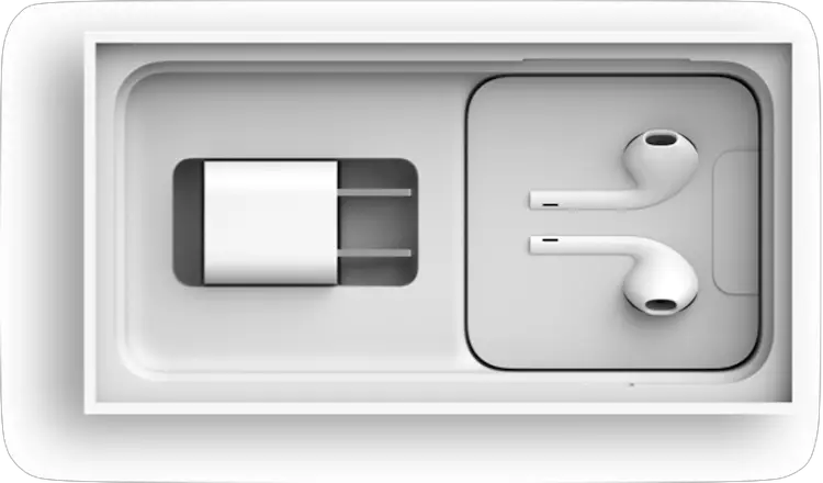
iPhone packaging
The designers are tasked with opening hundreds of prototype boxes. Those designers then create and test endless versions of box shapes, angles, and tapes. At its core, this isn’t just about how the package looks, it is also about a package that’s easy for customers to open, easy for them to identify the components, and easy for them to start using.
So, there you have it. The best designs are those that evoke emotion. Product packaging has a real, measurable influence on how consumers feel about products. And people are far more likely to invest in a brand when it makes them feel positive.
As we look to the future of product packaging, the clear demand for sustainable packaging is set to continue, with 61% of consumers limiting their use of single-use plastic and 34% opting for brands that have environmentally sustainable values or practices.


