7 Logo Design Tips for Construction Companies
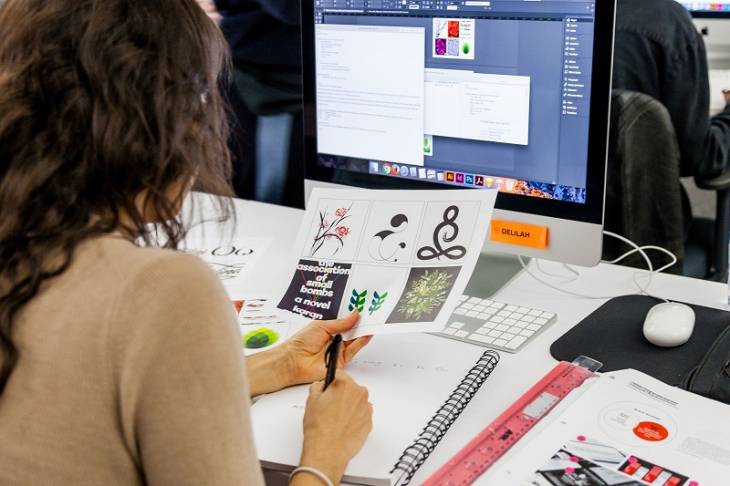
What comes to your mind when you think of a construction company's logo? A hammer and nail, perhaps a drilling machine or a building as an icon?
We usually associate certain icons as symbols for certain businesses. For a construction company, this is definitely something to keep in mind.
A logo is usually ideal when it is straightforward, sends a clear message to potential clients, and stands out.
So what are the few things you can do in order to choose and design the right kind of logo for your construction company?
Best Logo Design Tips
Here are a few tips to help you sail through the process!
1. Minimalistic
Various research shows that a simple and minimalistic logo has a better chance of success than a complex one. A simple logo is unmistakable and can be remembered at first look.
Designing a neat logo that is clear and minimalistic can be very effective. Using a contrasting color and font, an outline to the logo helps maintain the simplicity and relevance of a logo.
Construction simple and minimalistic logo design.
2. Bright Colors
Any popular construction logo maker today presents various colors to pick and choose from. Using a bright color and different gradients of colors can help to make a logo more memorable.
Construction companies have a reputation for presenting a drab and boring logo that does not really appeal to the common eye. That is why some bright and lively colors will show the customers that they can expect something interesting and creative from your company.
3. Geometric Shapes
Geometrical shapes like squares, triangles, circles, and straight lines keep on winning. These are ageless design shapes that actually never go out of style. They can give your logo a fair and steady look.
When these shapes are consolidated, layered, and planned appropriately, they give a clean, visual character to your company logo. Especially with construction companies with machinery and buildings, they are a fantastic choice.
4. Negative Spacing
This strategy is very popular in the logo design industry. Logos with negative space creatively use the white space within an image (or letter) to create a whole new image, creating recognizable images in the middle of the letters or wrapped up inside the content.
This negative space planning is a unique and creative approach to pass on your brand's essence in your logo.
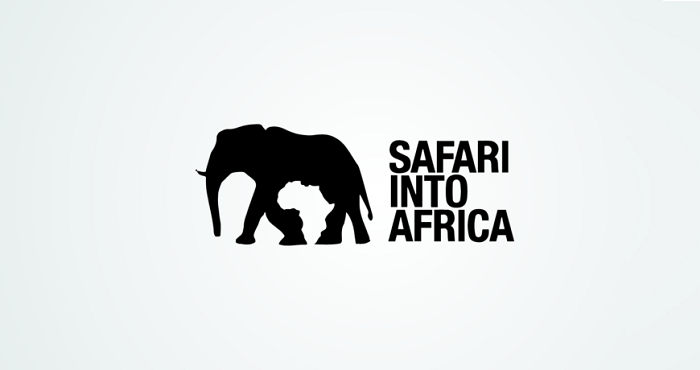
Safari into Africa negative space logo.
5. Creative Typography
Designers love typography and will continue exploring this art for many years. Words are a useful asset to pass a message to audiences. The right utilization of clean typefaces will enhance the look of your logo.
When combined with images, your message can have a wider appeal and reach. Some typography types include Garamond and Times, as well as fancy split letter font styles, handwritten text, and 3D designs to personalize your logo.
6. Gradient
Gradient designing or color transitions is the gradual blending from one color to another color. It isn’t limited to two color shades; mix and match, play with different colors, and you will discover how creative this designing form is.
Gradients became trendy in recent years when brands like Firefox and Instagram transformed their logo design with gradient patterns. Angles or shading changes can be applied to both content and symbols. They are intriguing to the eyes and present excellent outcomes to brand logos.
7. Monogram
Monogram logos, also known as letter marks, are made of letters, usually brand initials. When planning a monogram logo for your company, you’ll need to have it encapsulate your organization.
By utilizing the right typography with a creative and appropriate monogram, you can present a particular visual of your brand and logo that’s memorable and easy to remember for quite a while.
New York monogram logo.
Your logo shouldn't just be appealing and eye-catching, but also should maintain your brand’s positive image, style, and reputation.
Stay up-to-date on the latest and best trending patterns and designs to inspire your creativity when designing your company logo, so you stay ahead of the competition.
Being creative and cognizant of trends within your industry, you can create a powerful company logo that grabs attention, makes a strong first impression, and fosters brand loyalty.
The main idea should be to stay in trend and stand out from others.


