All You Need to Know About Visual Branding
 Marketing expert and Editor, Qeedle
WWS contributor
Creating a strong brand is vital to make your business stand out from the competition. But you cannot have a successful brand without a strategy for its visual components.

You cannot have a successful brand without a strategy for its visual components. Your visual brand makes your organisation stand from the competition.
To build brand recognition and capture the attention of your audience, you need a strong visual identity.
The following aspects of your visual brand are key to making a great first impression among consumers:
1. Brand Mark
KFC, McDonald’s, Adidas, Coca Cola… all big brands have powerful, recognisable logos. You see a red target on a billboard and you know it’s an advertisement for the iconic retail chain, and not for some archery camp.
Your typographic brand or your logo is your brand’s unique signifier. It is the starting point of your visual identity. Your business should be the first thing to come to mind when people see your logo. Moreover, your brand mark should reflect the distinct emotional appeal of your brand.
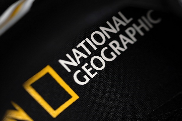
The great thing about logos is that they don’t need to be complex to work. Simplicity and minimalism can take you far. National Geographic’s logo is a perfect example of this.
2. Color Palette
There is a good reason why construction workers wear day-glo and why opposing sports teams wear different colours. If you have a job interview at a bank, chances are you’ll wear a dark and subdued suit. Colours speak volumes.
And the colours of your business tell us just as much as the clothes of a person. In marketing and branding, the psychology of colour plays an important role. The colours of your brand should trigger a response from your target audience, showcase your belonging to a niche or industry, and differentiate you from the competition.
Your brand colour pallet, which should be composed of the right selection of colours, can elicit different emotions and can carry different connotations. Think about your target audience and the emotions you want to evoke when choosing your brand colours.
Your colour palette requires careful consideration. Many companies change or redesign their logos every once in a while, but they seldom change their colours.
When it comes to branding, including visual branding, consistency is key. For instance, on-point visual branding is a crucial element of a great website. However, not only do you need to make sure the colours on your site create a branded feel, but you also need to make sure they are creating a cohesive visual identity across all the platforms you are using (e.g. social media, print, merchandise, etc.).
Consider the colours in use. Do they complement each other? What colour is your star and who plays the supporting roles?
3. Typography
The style and shape of your text convey your brand’s visual voice. When it comes to fonts, you have many choices. You can go with a techy and trendy font or you can choose a tried and true classic font such as Garamond.
Go for typefaces that showcase your brand attributes. Just like your colours, your typography needs to be consistent. While the typeface you use should represent your brand personality, it doesn’t mean you have to go for something that is unique and offers depth.
It’s more important to make sure that your font is simple as well as an eye-catcher. Finding a font that balances the two characteristics well should be your priority.
If you need inspiration, check out Marvel’s font. Their logo features a one-coloured background and a simple font. It’s precisely the simplicity that allows Marvel to experiment with its logo across different platforms.
4. Imagery and Graphic Elements
Surely, you have heard the expression, “A picture is worth a thousand words.” Well, when it comes to branding, this only goes for carefully chosen images. Whether we are talking about your site, social media accounts, or print advertisements, you need to align the images you use with other elements of your brand strategy.
Is the feel of your brand cosy and homey? Your imagery should be as well. Clean and spare? Make sure your photos reflect that. You should go for a consistent style when purchasing stock photos or creating imagery.
However, keep in mind that stock photos are all over the place. Your competitors can access them just as easily as you can. As a result, they can appear impersonal to consumers.
One study found that authentic photos of employees have a better effect on customers than stock photos. Stock photos may be more affordable, but a photoshoot of your own can deliver a better ROI.
To reinforce your brand, you can use infographics, icons, chart styles, and colour blocks. Graphic elements are a big part of your visual language. You should spread them cohesively across your organisation’s virtual and physical presence.
When it comes to your website, you need to pay attention to where the items are on the page grid, the size of images, and the amount of white space. All of these elements work together to draw the eyes of visitors to the information you want them to see.
Conclusion
Visual branding is a process that encompasses recognizable colours, nice designs, and unique signifiers. Your visual identity tells the story of your business. But visual branding requires some work. Take the time to compare different colour schemes and designs until you are completely happy with the result.