
When to Use a Histogram in Data Analysis

A histogram is a graphical representation of a distribution of data. In other words, it is a graph that shows how many data points fall into each category.
In business, economics, and other disciplines, histograms can provide a useful tool for analyzing data and trends. They are used when you want to see how the data is distributed and the frequency of occurrence of some measurable event or property.
But exactly when should a histogram be used in business or other discipline?
Well, some of the histogram chart’s most important use cases and applications include:
1. To understand data that has a single independent variable
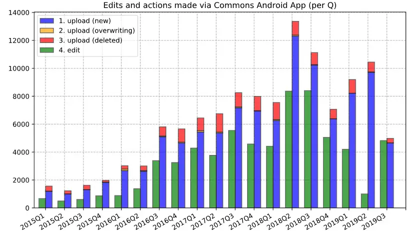
Histogram of website uploads. Photo: Misaochan / Wikimedia.
A histogram is a graphical representation of the distribution of data. It is used when the data has a single independent variable.
The independent variable is the variable that is being manipulated by the researcher, while the dependent variable is the variable that is being measured.
So, a histogram can be used to determine the shape of the distribution, the center of the distribution, and the spread of the distribution.
It can also be used to compare the distributions of two or more sets of data.
2. To study data that has a continuous range
A histogram is best used when data has a continuous range. This is because a histogram can show the distribution of data more accurately than a bar chart.
In a histogram, the area of each bar is proportional to the frequency of the data it represents. This makes it easy to see the distribution of the data.
3. To compare two data sets
Histograms are a great tool for comparing the frequency distribution of two data sets. The two data sets can be the same, or they can be different. They can be from the same population or from different populations.
To compare the frequency distribution of two data sets, you first need to create histograms for each data set. Then, you need to compare the two histograms.
The most common way to compare histograms is to use a histogram comparison tool or histogram overlap tool. This is one of the best ways to compare the frequency distribution of two data sets.
4. To analyze frequency distribution
Many people don't realize just how powerful and versatile histograms are for data analysis. In particular, histograms are particularly helpful to analyze the frequency distribution of sample data.
While histograms are most commonly used to analyze frequency distributions, they can also be used to analyze other types of distributions, such as the normal distribution.
In particular, histograms can be used to determine the shape of the distribution, the center of the distribution, and the spread of the distribution.
5. To determine data symmetry
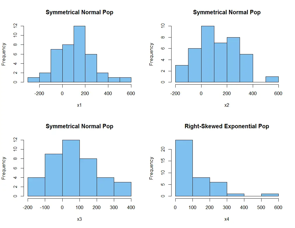
There are three main types of distributions: symmetric, left-skewed, and right-skewed. A symmetric distribution has a mean that is exactly in the middle of the data range.
A left-skewed distribution has a mean that is to the left of the data range, and a right-skewed distribution has a mean that is to the right of the data range.
A uniform distribution has a mean that is around the middle of the data range, but the bins have almost the same number of data points. This distribution is not common. Most distributions are either symmetric or skewed.
6. To study change over time
Histograms are used to analyze how process outcomes change, and can be used to identify and correct problems.
For example, if a histogram shows that most of the data points are clustered around the middle of the range, this could indicate that the process is not producing consistent results. Alternatively, if the data is spread out over a wide range, this could indicate that the process is producing inconsistent results.
Histograms can also be used to determine the variability of data. This is done by calculating the standard deviation, which is a measure of how spread out the data is. The standard deviation is calculated by taking the square root of the average of the squared differences between each data point and the mean.
Because histograms can be used to determine the variability of data, they can be utilized to identify and correct problems in a process, whether in business or another field.


