The Story Behind Some of the World's Most Famous Logos
Logos are the faces of brands, serving as graphic versions of the brand name. When logos are created, they’re designed to personify and embed the brand and what it stands for, so that prospective customers recognize them in an instant and are drawn in.
The logos of the most successful, and usually the largest, brand names become iconic – flowing out into culture and becoming cultural references in themselves.
- Logo expert looks at the creation of the most recognizable logos and how they have changed
- Every logo tells a story – the good ones make people listen, from Nike to Coca-Cola
- The best logos are the best storytellers – they can become cultural icons
Logo Expert Tells the Story
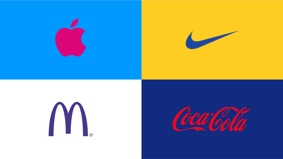
“Google, Apple, Nike, Amazon, Coca-Cola – these giant brands all have instantly recognizable logos that represent them and send out messages subconsciously,” says Richard Lau, company president of LOGO.com, a platform that simplifies the process of creating professional logos for businesses of all sizes. “That’s why they work so well – because brand recognition is subliminal. But most importantly, they drive desire – the marketer’s ultimate goal.”
Richard, who has significant experience of, and great insights into, the world of brand logos, adds:
“Logos are the faces of brands, but some faces are more recognizable than others. A logo should embody a brand’s values at a glance or less, so that people make instantaneous shopping decisions – sometimes subconsciously.”
Iconic Logos’ Stories
Every logo tells a story, and has a story behind it. It’s fascinating to take a look at the stories behind some of the world’s most iconic logos, says Richard:
1. Google
When Google was founded in 1997, the team wanted a logo that would signal a playful and creative character, but one that was set up to be a heavy hitter when it came to information and search. The first Google logo was a fairly simple affair designed by Sergey Brin. In 1999, Google chose to emphasize its playful nature. The team enlisted a logo designer called Ruth Kedar, who came up with the colorful Google logo with shadows behind the letters that is now so familiar.
“By 2010, the shadows of the Google logo’s letters were minimized, and the colors became slightly more muted,” says Richard. “By 2013, when Google was well on the road to becoming the search behemoth we now know - the letters’ shadows were dropped entirely, and the logo featured a flatter, simpler design. Every subsequent version of the Google logo features the original blue, red, yellow, and green - colors intended to signal the company’s bold, playful, and unconventional nature.”
2. Apple
Apple’s first logo was born in 1976. It was a picture of Isaac Newton under an apple tree designed by Apple co-founder Ronald Wayne. But Steve Jobs wanted a simpler logo. So, the now-iconic Apple icon, with a bite taken out of it, was innovated by Rob Janoff in 1977.
This new logo featured a rainbow-colored apple, as a nod to Apple's color capabilities in its Apple II computer. The bite was both a play on the word "byte" and a way to indicate scale.
Richard comments: “The original rainbow Apple logo reportedly took about two weeks to create and cost $100,000!”
Since then, the logo has evolved to reflect and drive the digital landscape around it. In 1998, Apple began using a monochromatic version, and in 2001 they introduced the sleek, metallic apple with a bite out of it we're familiar with today.
3. Nike
The Nike “Swoosh” was created in 1971 by Carolyn Davidson, a student of graphic design. Phil Knight (Nike’s co-founder) commissioned her to create a logo for his shoe company, then called Blue Ribbon Sports.
Davidson was paid just $35 for her work, drawing inspiration from the winged Greek goddess Nike, known for speed and victory. The Swoosh's simplicity and implied motion resonated so strongly that it was reportedly partly responsible for the company’s rebranding from Blue Ribbon Sports to Nike in 1971.
“The Swoosh's journey is a testament to the power of great design. It’s now one of the most recognizable symbols globally, valued at an estimated $26 billion” Richard adds. “Nike later acknowledged Davidson's role in the company’s success by gifting her 500 shares of company stock and a diamond Swoosh ring.”
4. Coca-Cola
John Pemberton created Coca Wine in the 1860s “for fatigue of mind and body.” John’s partner and bookkeeper, Frank Mason Robinson, suggested the Coca-Cola name, thinking that “the two Cs would look well in advertising.” The first known use of the Coca-Cola logo was in an ad in the Atlanta Journal on May 29th, 1886.
The way the brand name – which is also the logo – is written also has an interesting background: Frank Robinson wanted the brand name to have a unique visual style, so he experimented with an elaborate Spencerian script, a form of penmanship characteristic of the time.
“Thus, the modern Coca Cola logo was born”, says Richard. “While its context has evolved and changed a lot since then, the logo itself hasn't changed a great deal. The Coca Cola logo, in all its forms, has existed so long that it's become part of world culture. People automatically associate it with the much imitated refreshing, stimulating and sweet drink product we all know.”
History and sheer market penetration can endow some logos with such familiarity that they pitch the product to the customer automatically and instantaneously – a win-win for marketing departments. This, of course, is a reason for brands not to change their logos, but instead to tweak them as the landscape, now mostly digital, shifts around them. Smart branding leverages this shift profitably.
Richard Lau concludes:
“Logos pack a lot of meaning into a small space, and their effects work in milliseconds, making people think and feel certain things about a brand immediately. The best logos work everywhere, from tiny phone screens to huge billboards, allowing brands to stand out in a crowded market.
“A good logo doesn't just make people remember a brand - it evokes desired emotions and thoughts related to the company’s product. That's why businesses spend so much on creating and protecting their logos - a strong logo is a powerful tool for connecting with customers."