Gmail Redesign Introduces Cool New Features (And Some Not So Cool)

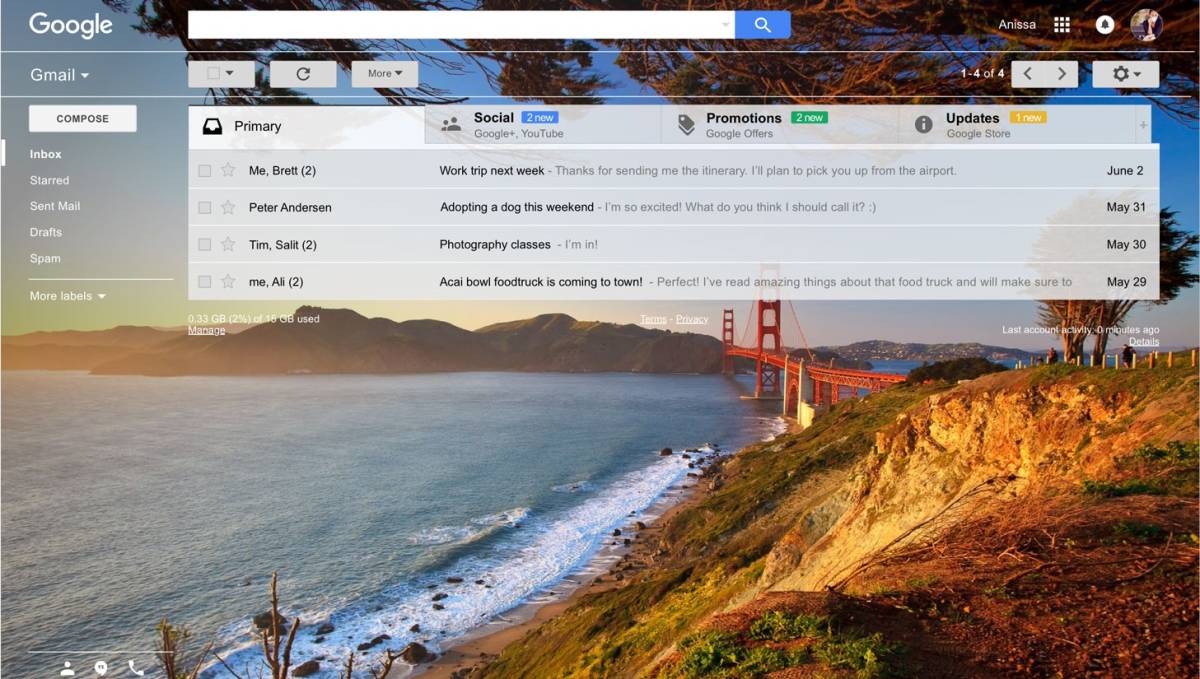
Google this week announced it is launching a revamped design of its popular email service Gmail “over the coming weeks.” The upcoming redesign of the email service will reportedly add a number of new functional features for Gmail users on the web that were originally introduced in Google’s 2014 overhaul of Inbox in Gmail on mobile.
News of the impending Gmail redesign was revealed in a leaked internal email Google sent out Wednesday to G Suite administrators, who manage the G Suite domain, alerting them of the coming changes.
A Google spokesperson confirmed the news to some news sites, saying:
“We’re working on some major updates to Gmail (they’re still in draft phase.) We need a bit more time to compose ourselves, so can’t share anything yet—archive this for now, and we’ll let you know when it’s time to hit send.”
If the leaked memo and screenshots are to be believed, the redesign brings Gmail on the web closer to tweaks made for Gmail on mobile devices.
Cool new features to look out for
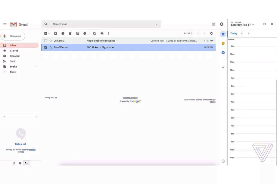
Google is set to introduce a new sidebar on the right side of Gmail on desktop that can display a large view of your calendar. If someone sends you an email suggesting meeting times for later in the week, you will be able to glance to the right to see when you’re free. The sidebar will also be able to display Google’s handy to-do-list app Tasks that already comes built into Gmail, or the impressive note-taking app Keep.
Besides the new sidebar, Google will add a new “Snooze” button borrowed from the mobile version of Gmail. When you hit this button, you will be able to snooze emails on desktop to remove messages from your inbox until a set time. This way, you can temporarily de-clutter your inbox and ensure you don’t have to worry about missing important messages.
Moreover, the refreshed design will add to the Gmail web version Smart Replies—those AI generated smart suggestions for quickly replying to emails, as well as native offline support for Gmail. The native offline support feature once it goes live will likely retire the Gmail Offline Chrome app, although this (or a timeline for such a move) hasn’t been announced.
Additionally, there will be three new Gmail layout options to choose: a default view that highlights attachments like photos, a comfortable view that doesn’t highlight attachments, and a compact view that increases the number of messages you can see on a page. The compact view is the one that most looks like the existing Gmail layout, if you still like the current layout.
Not so cool features
 The expected facelift appears to include a change of text fonts. The default font for Menu items, for example, changes from Arial to Product Sans, while messages and email change from Arial to Roboto. Roboto and Product Sans were created by Google and are supposedly easier to read on mobile. Both fonts are now the primary fonts used in the Android operating system.
Not everyone likes Google’s supposedly “friendlier” mobile-first fonts, though. Some designers say the two fonts are actually harder to read, specifically calling out Roboto as an Arial rip-off. Either way, you will be the final judge as to whether the new fonts for the desktop version of Gmail are cool or not.
Overall verdict
All in all, with all the changes soon to be introduced to Gmail, Google says its ubiquitous email service will be more “streamlined and clean” design-wise.
Google did not say exactly when all these changes will come, but its I/O developer conference is set for May 8th in Mountain View, California. It’s fairly safe to assume this new Gmail design, even if still in the draft phase, will be part of the announcements made at the event.


