10 Ways to Make Your Logo Design Stand Out from the Crowd

How many logos do you see and know exactly the brand they represent because the logo stands out for you?
It’s a compliment to a business when people see its logo and immediately know who they are. That means they’ve done something right.
Logos are more than just a symbol. They are a symbol that represents everything about the brand—it’s the brand identity. For people to know it when they see it, a logo has to stand out.
If you want a brand that sours above the rest, you need to make sure the logo is perfected and stands out from the crowd. A perfect logo stands out.
Here’re some top tips to make your logo stand out from the crowd:
#1. Start from an Original Thought or Concept
Make sure your logo is original. Sure, it’s good to get inspiration from other designs, but no one wants to look at your logo and get it confused with another company.
When your logo resembles too closely to another business, not only are you getting the short end of the stick because people don’t realize it’s your company, but you come off as lazy putting very little thought into your logo.
Very few people want to do business with someone who has a limited imagination. So, study other designs, but then conceptualize something that’s never been done before. You can hire a graphic expert to bring those thoughts to the page.
#2. Avoid Clipart

Part of being original is doing something that hasn’t been done before. If for no other reason than that, you need to avoid using clipart for your logo.
It’s understandable if you don’t have the skill to design an original graphic, but there are many graphic artists out there, easily available online. Hire one to do the graphics for the logo design.
There’s no sense in having an original thought if we’ve already seen the graphics.
#3. Let What You Do Be the Focal Point
One of the greatest advantages of a logo is that it speaks for you. A logo can say so much about your business—what you do, who your audience is, etc. Make sure your logo speaks to what you do.
When people are looking for a business, they should be able to take one look at your logo and know you’re the one for the job. Your logo can open doors for you and bring in business as you’ve never seen.
Consider the goods and services you offer and your audience, and you’re on track to having a perfect logo.
#4. Make It Adaptable
Consider how your logo will be used? Will you only need it for letterhead or business cards? Probably not. You’re likely planning to do big things and will need for your logo to be everywhere—on billboards, posters, websites, television, t-shirts, pens, you name it—that’s where you want your logo to be. You’re not going to limit the marketing of your business.
Branding is about marketing endlessly to your audience. That may consist of being in places that were unthinkable at one point in your journey. You need a logo design that will be adaptable across all platforms.
Whether a thumbnail or on the biggest billboard ever, your logo should be designed so that no matter what it’s on it will look good and be easy to apply.
#5. Complement With Color

You want your logo to send the right message, and the colors you use play a part in that. Consider what you do, then see how certain colors fit the personality you want to portray.
Every color represents a personality. Find the color(s) that represent what you’re going for and then use that within your logo. If you use multiple colors, they should be colors that complement each other.
You may even do a mixture of certain colors to get something original that really complements the brand.
#6. Speak Wisdom With the Fonts
Ideally, you want to have an intriguing font style that makes your logo stand out. But be careful about mixing certain fonts; not all of them will look well together.
For instance, mixing two completely different styles like a flowing handwriting script and modern sans serif might not be the look you’re going for.
It’s also important to know the characteristics of styles, like what is characteristic of being sleek or romantic. Handwriting suggests a more romantic characteristic. So, consider staying with a family of fonts rather than being all over the place with them. That makes for easier reading, keeps it cohesive, and also shows professionalism on your part.
The last thing, keep the number of fonts to a minimum. If you use more than two different fonts, it may start to look a little cluttered.
#7. Ensure Universal Meaning

The more adaptable your logo is across all formats, the more visibility it will get. There’s nothing limiting your logo from being seen by anyone because it’s everywhere.
When your logo is everywhere, it is universal. You want a logo that will be recognizable from one end of the globe to the next. It should be far-reaching from Denmark to South Georgia, your goal is for everyone to instantly recognize your logo when they see it.
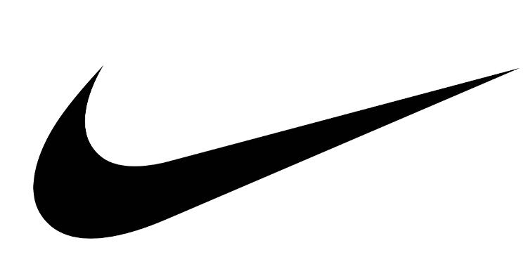
One of the most recognized symbols anywhere is the Nike logo. It doesn’t matter where you go, when you see this symbol you know exactly whose it is. You immediately recognize the brand and the loud noise it makes. This is the swoosh symbol known around the world.
#8. Encourage White Space
Some people see white space and see something missing; others see white space and decide to make the best use of it.
White space doesn’t always imply that something needs to be added. Use your imagination and creativity to see what that space could portray in the mind of the viewer.
Many of the best logos use white space to their full potential, and you can too. That also shows your originality, as your white space can only work for your brand.
For example, you may be familiar with the hidden arrow in the FedEx logo between letters E and X. It stands for speed, accuracy, strive for perfection, and perseverance in achieving goals.
How about the animals portrayed in the Pittsburgh Zoo logo? On each side of the tree, the white space does an excellent job of assuring us that if we love animals, we’ll love this place.

#9. Simple Is Best
While a lot has been suggested here, don’t misinterpret it all for what it really is: simplicity. From color and font choices to how you use every space within that logo, it should all come together simply.
It can be very tempting to go above and beyond and end up going overboard with your logo. But doing too much can cause the logo to look confusing and unprofessional. Rather than attract your dream clients, it’ll end up leaving people wondering what exactly it is that you do.
Apple has one of the simplest logo concepts ever. It’s just an apple with a bite out. The concept has always been about an Apple with the first thought in 1976. But, over the years the symbol became simpler. It’s changed a few times and now is even void of color. The new monochromatic logo is still one of the most recognized visuals seen today.
So, don’t complicate the look of your logo. Keep it simple. It doesn’t need a lot of bells and whistles. It just needs enough to say who you are and what you do, in an appealing way.
#10. Make It Memorable
When all is said and done, when you’ve created the perfect logo, it will be memorable. Since 65% of people prefer visuals for learning, they’ll decipher a lot from your logo and will keep it at the top of their minds if it stands out.
Doing the steps listed here will get you that. You will have a logo that stands out from the crowd and will be easily remembered by all who come in contact with it.


![9 Tips for Managing Your Online Writing Projects Efficiently [node:titile]](/sites/default/files/styles/video_thumbnail_bottom/public/open-book-laptop-online-writing-tips.jpeg?itok=rI4zR3a-)


