Design More Compelling Graphics for Web and Social Media Marketing
According to web design expert Steven Bradley, our eyes take in more visual data than our brains can process consciously. Our eyes always want to concentrate on the most attractive information, so we selectively look at what we think is significant.
Research actually shows that we can get distracted by visual data even when it is irrelevant. If it is compelling enough, it will grab our attention even unintentionally.
And as human beings, we can’t help but be visual when we are passing a signboard, browsing through a magazine, surfing the internet or watching TV. Everywhere we look, there is content. But we don’t remember most of it.
Can you recollect the advertisement you saw on Twitter thirty minutes ago? If it doesn’t attract you, chances are, you don’t remember it.
Therefore, for brands and marketers, creating website and social media creatives that are unique doesn’t stop at content. It also has to be visually interesting and compelling to impact the viewer as desired.
Steps to Create More Effective Graphics Designs That Grab Attention

Here are six ways to make your website and social media graphic designs more interesting and effective enough to engage audiences:
-
Set Your Goal
The first and the most critical tip to remember is that when you create a graphic design for web or social media marketing, you need to have a goal in mind. Establishing a goal will be the foundation for developing the design for your content.
You have to figure out what you’re doing and how you’re going to make a story through it. Goals will not only guide design, but also let you tell your message through visual.
To set the goal for your graphic designls, ask yourself questions like:
- What is the scope of this post?
- Am I attempting to encourage sales?
- Am I doing this to increase traffic?
When asking yourself these questions, keep your audience in mind throughout.
-
Select the Right Colors
An important aspect for any design is color. It sets the mood, creates the atmosphere, and even invokes memories.
Behind every color there is meaning and psychology. Thus, determining a color scheme that displays the feeling you want your brand or audience to associate with creates consistency.
Figure out what your brand stands for: do you want it to convey fun, trustworthyness, competence, and so on? Then, pick colors that reflect your brand.
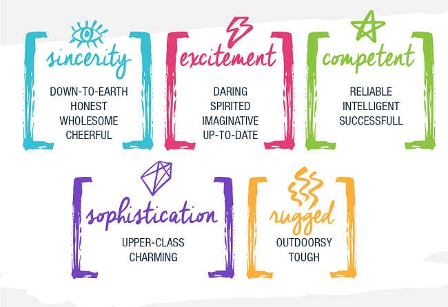
Psychologist and Stanford professor Jennifer Aaker identified five core dimensions of brand personality, including excitement, competence, sophistication, sincerity, and ruggedness, which can be associated with different colors.
Even though colors cannot be universally translated to specific feelings, because they are too dependent on personal experiences, try and determine the general feeling different colors evoke in your industry. Some colors can evoke a differnt feeling in a different industry.
Choose the right color theme for your industry to ensure your design fits well and complements your brand.
-
Select the Proper Text
Graphic design text is not to be confused with typography. Text is a string of words while typography is the visual element of the text. And the text is fairly important.
As the brand owner, you might feel like you want to tell everything through one design, but that is never a good idea as overcrowding the design is not only aesthetically displeasing, but it also turns off audiences.
Therefore, even if words are powerful, too much of it makes an image too busy and your audience gets overwhelmed. So, make your text easy to follow and pay close attention to the colors you use.
-
Pay Attention to Typography
Typography is a form of art on its own. Choosing the right font to align with images can be difficult, but when it is done correctly, it brings life into your simple graphic designs.
Like the color theme, the font should be chosen according to your brand’s personality. Three fonts are enough as many more than that will overwhelm your audience and the communication may get lost.
The purpose of a font is to let audiences know immediately who you are, they should know it’s you even if you don’t put on a logo, so keep it simple.
-
Contrast is a Necessity
It is well-known by most designers that white space (or negative space) is an excellent way to make your image prominent. Contrast appeals to the eye and can be used with alignment, color, fonts and more.
Text is a significant part of contrast as well. Selecting the right text size will transform your image. And remember to always use a dark font when you have a light background and vice versa.
-
Sync your Graphics with your Brand Identity
With the basics of graphic design for social media covered, you can now concentrate on your brand identity and how you can combine branding to advance your brand story.
The audience takes seven times to hear or see your brand to identify it. This implies repetition and consistency of your brand elements like color, fonts, and logo is important.
Ensure every image you post has your logo but don’t make that the most prominent thing. Sure, the logo will help in association but if your logo covers most of your image, it becomes too cluttered.
Conclusion
Now that you're familiar with these basic graphic design tips, you are better equipped to design more appealing, targeted, and effective graphics.
Go then and create better graphic designs for your website and social media campains that capture more attention and engage audiences.