How to Stand Out with Engaging Email Newsletter Design
 Copywriter, Moosend.
WWS contributor ![]()

Learn advanced methods to break through the noise with memorable email newsletters.

From bank invoices to order confirmations to promotions, our inbox is usually full. Some emails, we open them immediately, some are “kept for later," while others get overlooked between important messages.
As a brand, how do you make sure your emails don't fall into the last category? The answer lies in how you design your emails.
In this article, we'll discuss five advanced methods to break through the noise with memorable email newsletters.
1. Personalize with Dynamic Content
Memorable emails are all about personalized experiences for each recipient in your list. When your subscribers receive email content tailored to their needs and interests, they're more likely to engage with it and act on its message.
Of course, you may have several email templates saved for your convenience, to avoid creating each email from scratch every time. But this doesn't mean you'll use the same email template in every campaign you send, or that you won't tweak it to match each reader's expectations. Instead, you can personalize your email templates by adding dynamic content blocks to display different content to each recipient based on data like their location or purchase history.
With the rise of AI, it's even easier to create laser-focused emails. Reliable email template creators have incorporated AI tools so you can customize your email content and make every subscriber feel unique and valued. You just add dynamic content blocks to your email templates and AI technology fills them with personalized recommendations based on recipient behavior.
So, a food delivery service might leverage the same template as a starting point for their newsletter. By adding a dynamic content block to it, they can tailor a specific email section based on each recipient's history or preferences. For example, they could recommend seasonal vegetarian menus to recipients who’ve ordered vegetarian meals whereas it will display exclusive pastry items to those who've shown interest in desserts.
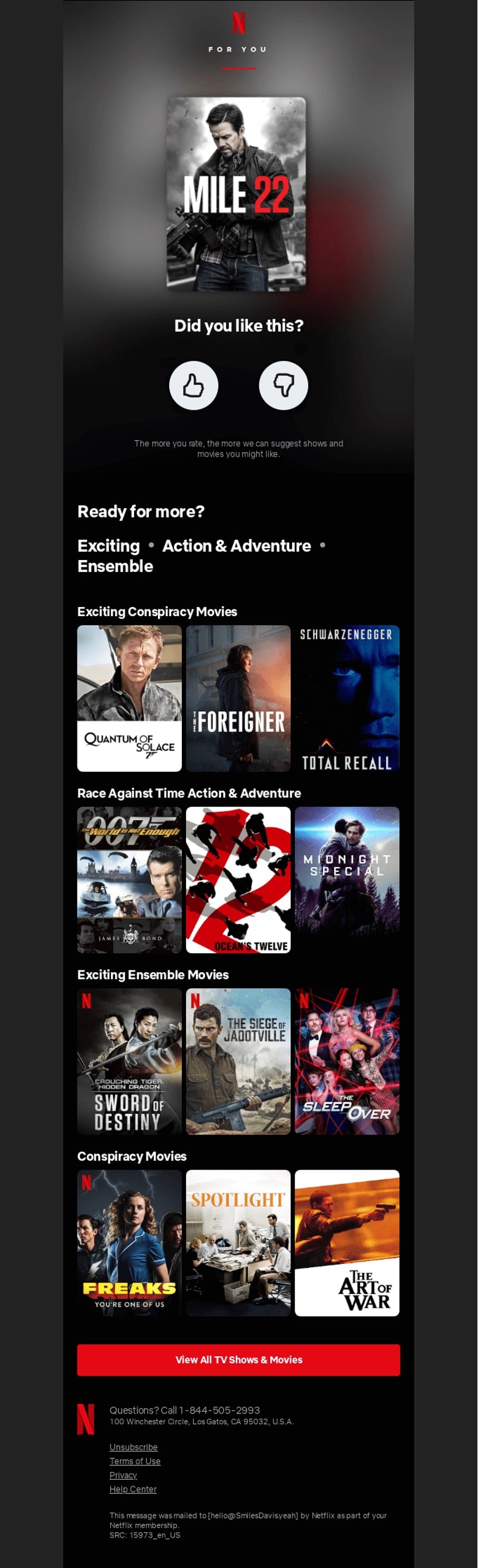
Netflix does an excellent job with personalized content suggesting relevant TV shows and movies to recipients based on their browsing and viewing history. The company adds a rating option so they can further train AI tools to pick the best recommendations for users.
2. Follow Email Accessibility Best Practices
With accessible email design, you're not just sending an email that everyone can read. You're actually making a statement: “Everyone is welcome here." And feeling welcome with a brand message means a lot to your leads.
First comes the ethical side. You should deliver the same email experience to all subscribers. But email accessibility is also a matter of strategic importance. When you deliver accessible email content, you communicate the value of your offerings to a broader and diverse audience. Not to mention that you come across as a brand that genuinely cares about each customer's needs.
So, what should you consider while designing your emails?
- Pick readable fonts, such as Times New Roman, Georgia, or Helvetica and a font size of at least 14px. These practices facilitate the reading process for individuals with visual impairments, learning difficulties, or even people with migraines.
- Be mindful of color contrast. For example, using red text on a green background is a recipe for disaster for color-blind recipients. So, use high contrast colors between text and background to enhance readability.
- Create well-structured emails with bulleted or numbered lists to separate different topics. You should use a logical hierarchy of information, too, by placing the most critical information at the top of your email.
- Include descriptive alt-text for images for users who have disabled them in emails. Alt-text also helps screen readers explain images to people with visual impairments. The same goes for descriptive link text which allows people with cognitive and visual impairments to differentiate between links.
3. Create Interactive Experiences
Interactivity in email newsletter design turns the routine of scrolling through an email into a fun and immersive experience. Some interactive components allow subscribers to act, which increases the time they spend on your email and their level of engagement. But did you know they can help you collect crucial subscriber data, too?
Let's see how you can make the most out of interactive email experiences:
- Integrate videos, infographics, animations, and GIFs to share insightful tips and best practices or show how your product or service works in a digestible format.
- Add gamification elements to generate excitement. For instance, add a spin the wheel feature to share a limited-time discount or a scratch card to display a promo code.
- Use image carousels to display different products, letting subscribers navigate between images and learn more about your products without leaving your email.
- Incorporate surveys, polls, and quizzes to collect important subscriber data. To ensure high completion rates, consider offering a small incentive to those who submit their answers.
Don't go over the top with interactivity, though. Not every newsletter should be interactive. Nor should you use many interactive elements in a single email as it may distract subscribers. Also, keep in mind that not all email clients display interactive elements properly.
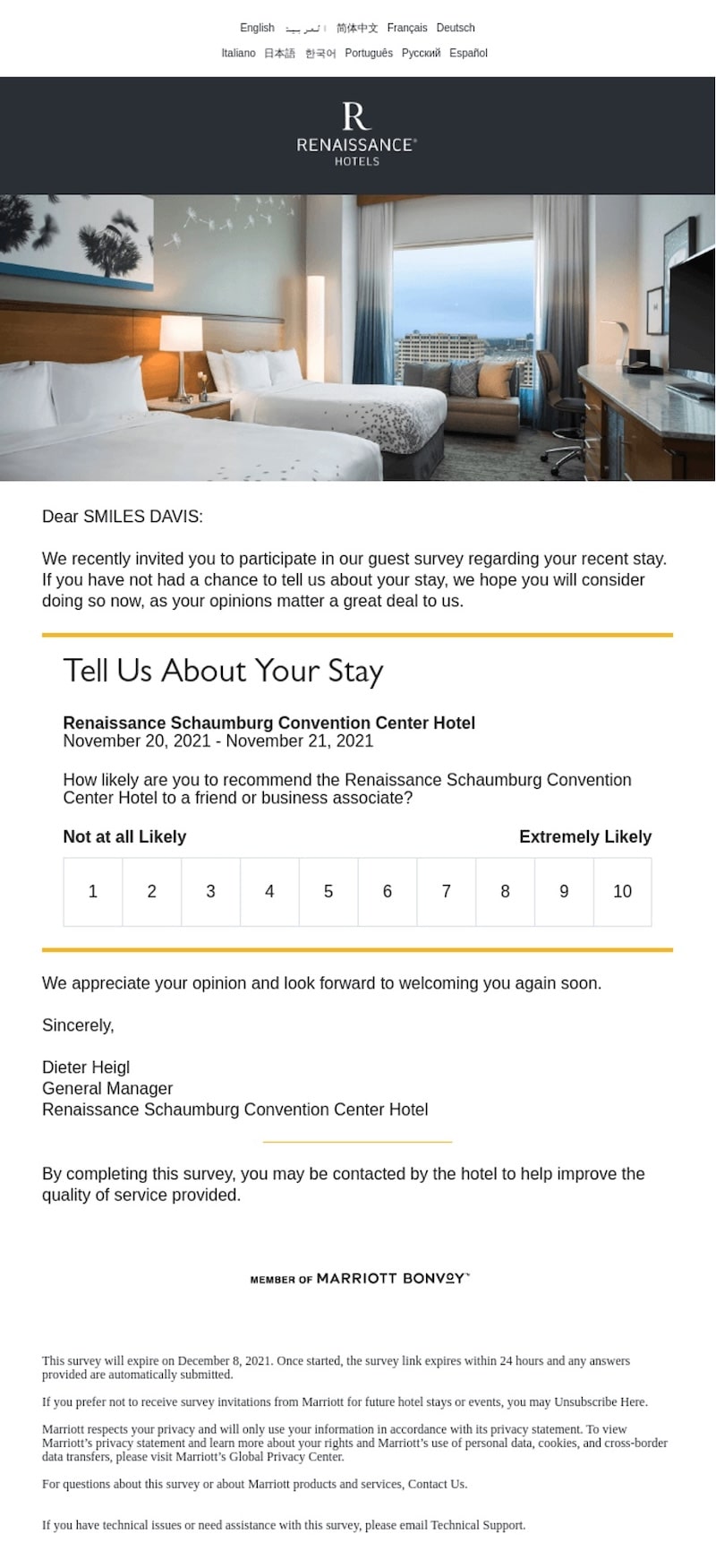
So, test your emails across email clients and create an HTML version for the ones that don't render interactive emails. Here's how Marriott.com incorporates a quick and simple survey into the email design to gather customer feedback on their stay:
4. Keep Your Design Minimal
Being bombarded with tons of messages, emails, or posts, it's only natural for subscribers to get distracted. By employing minimalism in your email design, you help readers stay focused on the essence of your message and increase their level of engagement.
However, there's a thin line between minimalistic design and boring—or overly simplistic. Minimalism is about keeping the essence of your emails, avoiding clutter and investing in aesthetics. So, here are the most common ways to achieve that:
- Keep your email copy as brief as possible. Focus on key information since recipients hate to waste time reading details that don't interest them.
- Use visuals strategically. While visuals catch attention and convey messages easily, going overboard could annoy readers or even slow down their devices.
- Limit the use of colors. Try to stick to two or three colors to keep things simple and avoid visual clutter. Monochrome colors also work great with minimalistic design.
- Invest in visual hierarchy. This means you should place the components that convey your core message at the top of the email, so recipients see them first.
- A minimalistic design should still include essential brand assets
- Try not to include multiple CTAs in your design if you're going for a minimalist style since it usually leads to a cluttered layout.
5. Invest in Nostalgia
Going back to the good old days is innate in human nature, especially during times of uncertainty. This is why nostalgia marketing keeps gaining momentum and retro design is back in fashion.
Nostalgic elements in email design feel familiar and soothing, reminding people of a time when they were carefree. This connection makes them hopeful, which, in turn, strengthens the emotional connection between your brand and your audience.
The most powerful way to add a retro feel to your email newsletter design is to leverage bright color palettes. But shades like navy blue, baby pink, or mint are equally effective in creating an old-fashioned look in email design. You can also use vintage images or modify an old image, so it matches your brand identity.
Another option to evoke nostalgia is through shapes and patterns. For example, if you want to create a design with a 50s theme, you should consider adding geometrical shapes whereas bold colors tend to remind us of the 80s.
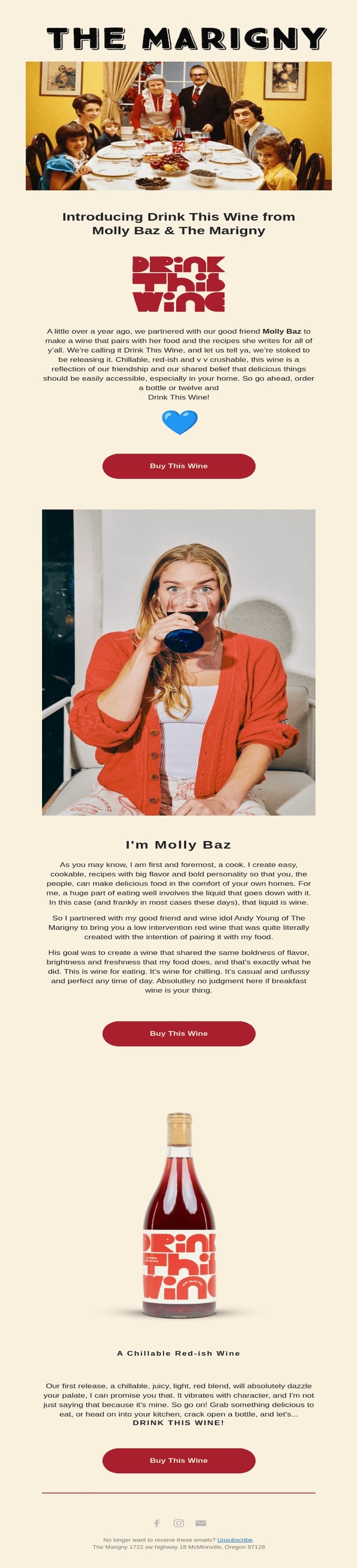
The Marigny email leverages a vintage image portraying a family around the table to introduce their new wine—while cleverly adding the bottle as an additional element within the image. The bold and contrasting color combinations used in both the email and the product itself are inspired by retro aesthetics:
In Conclusion
Capture attention with compelling email newsletter design. If there's something the abovementioned email tactics have in common, it’s that they help you improve email experience and build lasting bonds with your customers.
Some of the email design tactics might seem difficult to combine. For example, creating minimalistic emails might sound contradictory to adding interactive components. Or you could find that retro design elements like bold colors could cost in terms of accessibility. On the other hand, accessibility and minimalistic design share common guidelines.
So, how will you know which one to use and where? The key is to consider other essential factors like your target audience and campaign objective. Also, keep experimenting with different combinations to see what resonates with each segment. Finally, ensure you constantly adapt to new email design trends and changing customer needs to stay ahead of competition.


 to Speed Up Your WordPress Website")